BRANDING IDENTITY
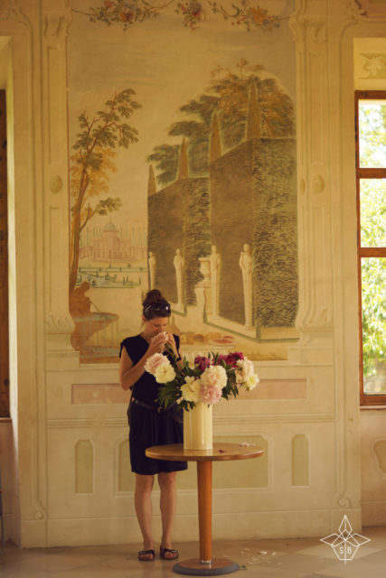
Sophie is an original Herb-Lady – exploring cliffs, hills, forests and streams, collecting Austria’s finest local herbs, wild flowers and mosses, creating natural products and sharing a wealth of information on her blog. She wanted an organic-zest – where modern pop meets Mother Earth.
LOGO DESIGN
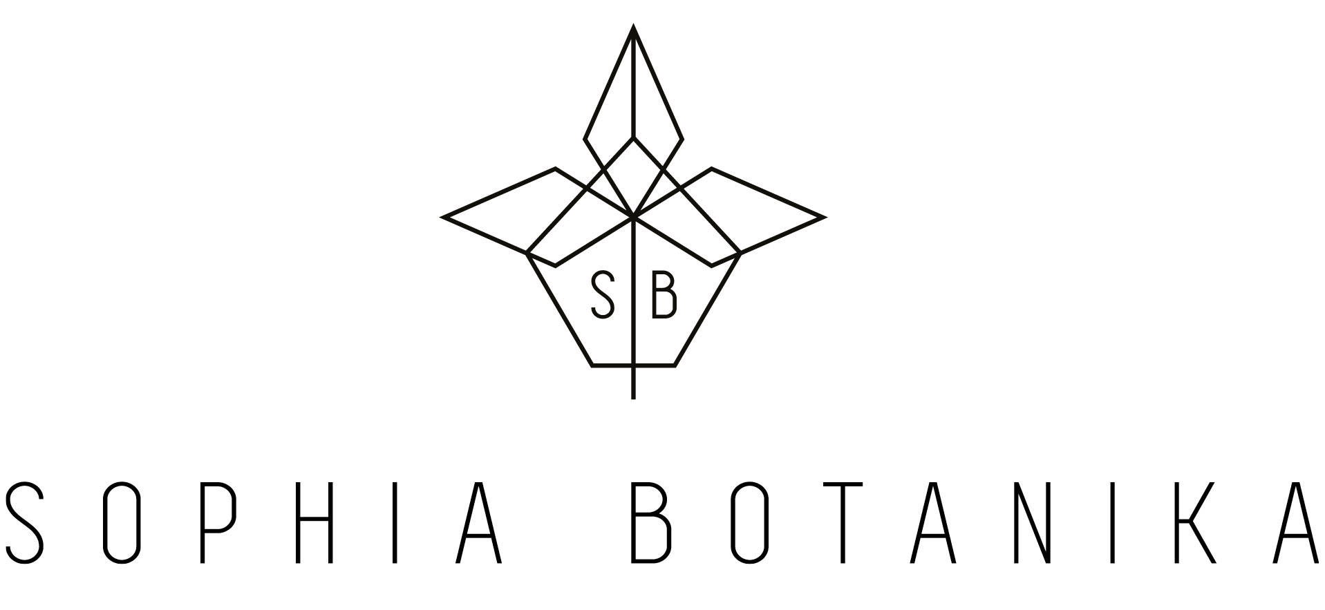
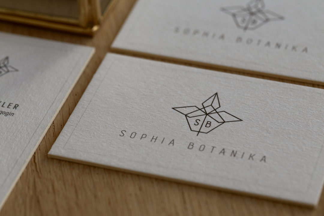
A reflection of the owner in many ways: some zest, some life, some simplicity, yet always looking for that personal touch.
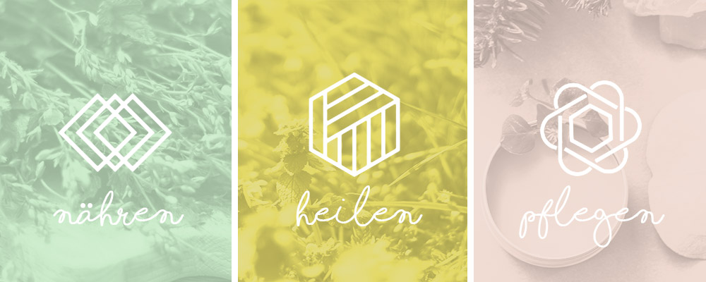
The three petals represent the three main topics of the blog: nourishment, healing, and care. The overlapping elements highlight the endless possibilities that herbs can be used. And that, is what Sophia Botanika is all about.
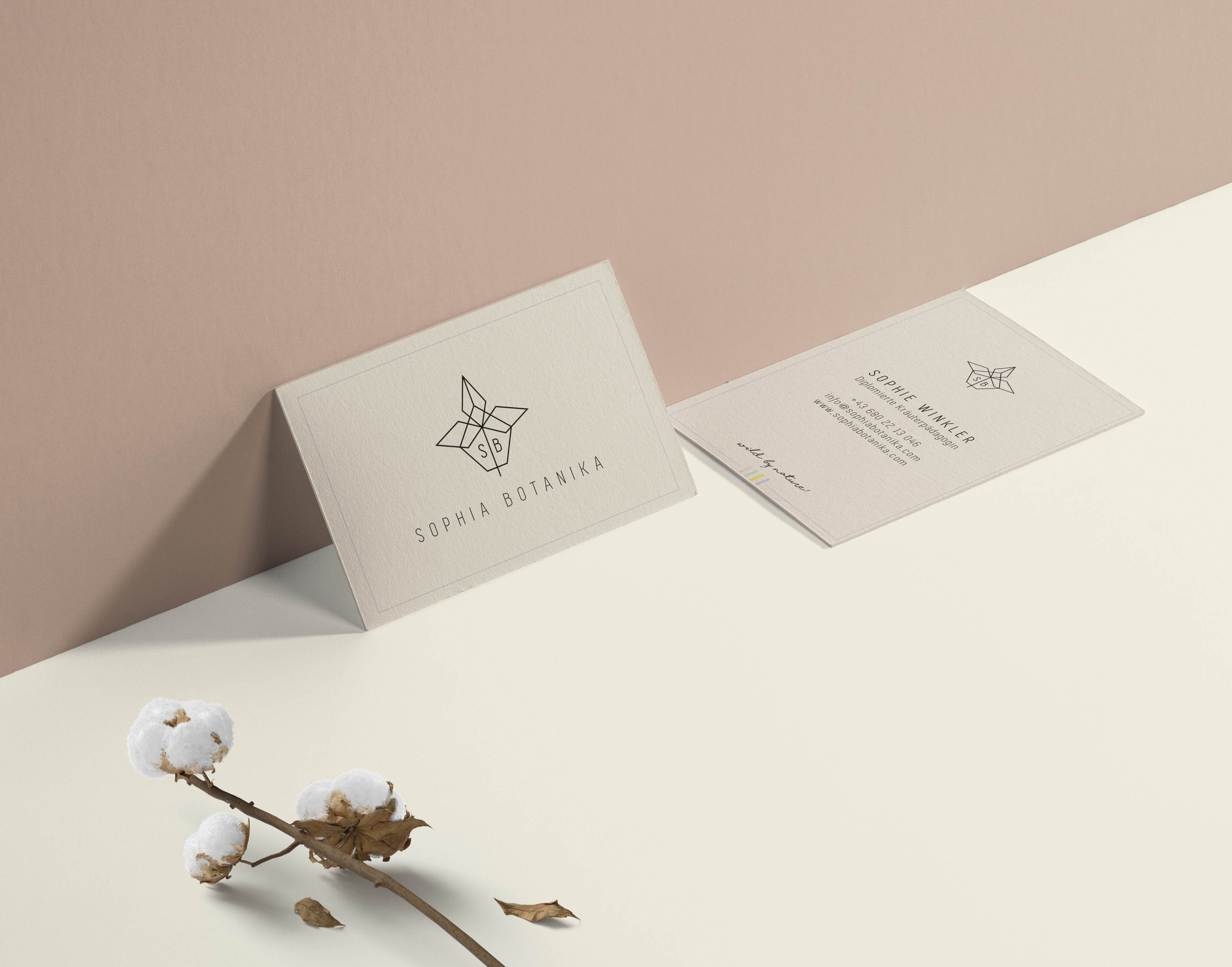
BUSINESS CARDS
KNOWLEDGE
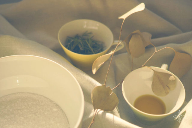
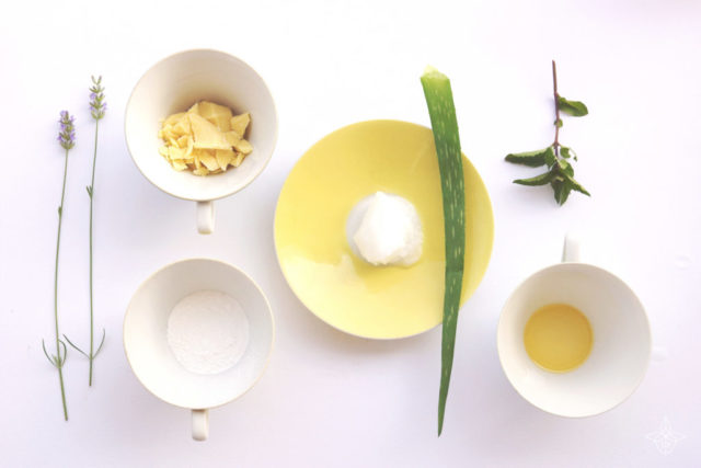
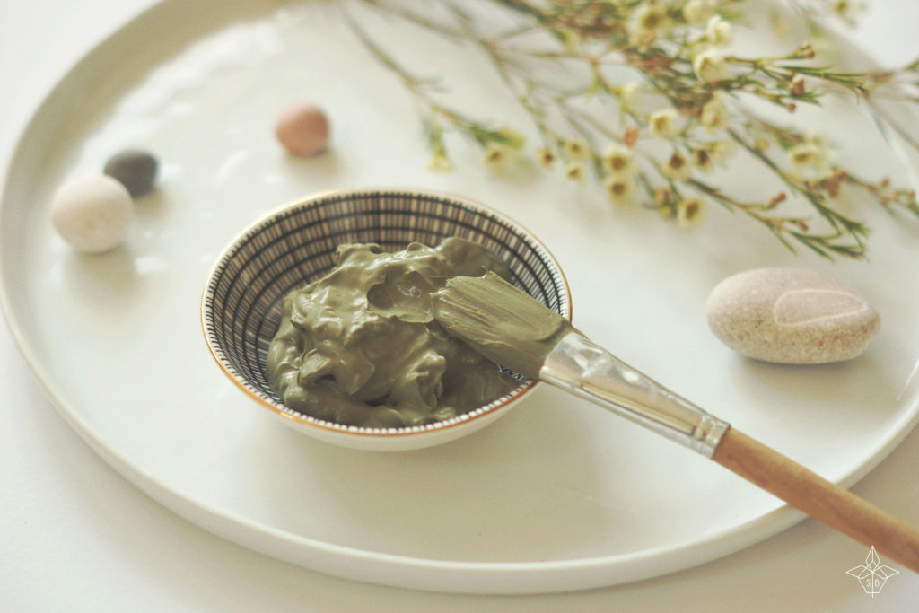
Through herbal hikes and workshops, Sophia Botanika shares the secrets of making natural cosmetics, soaps, syrups, cakes and home remedies using everything around us.
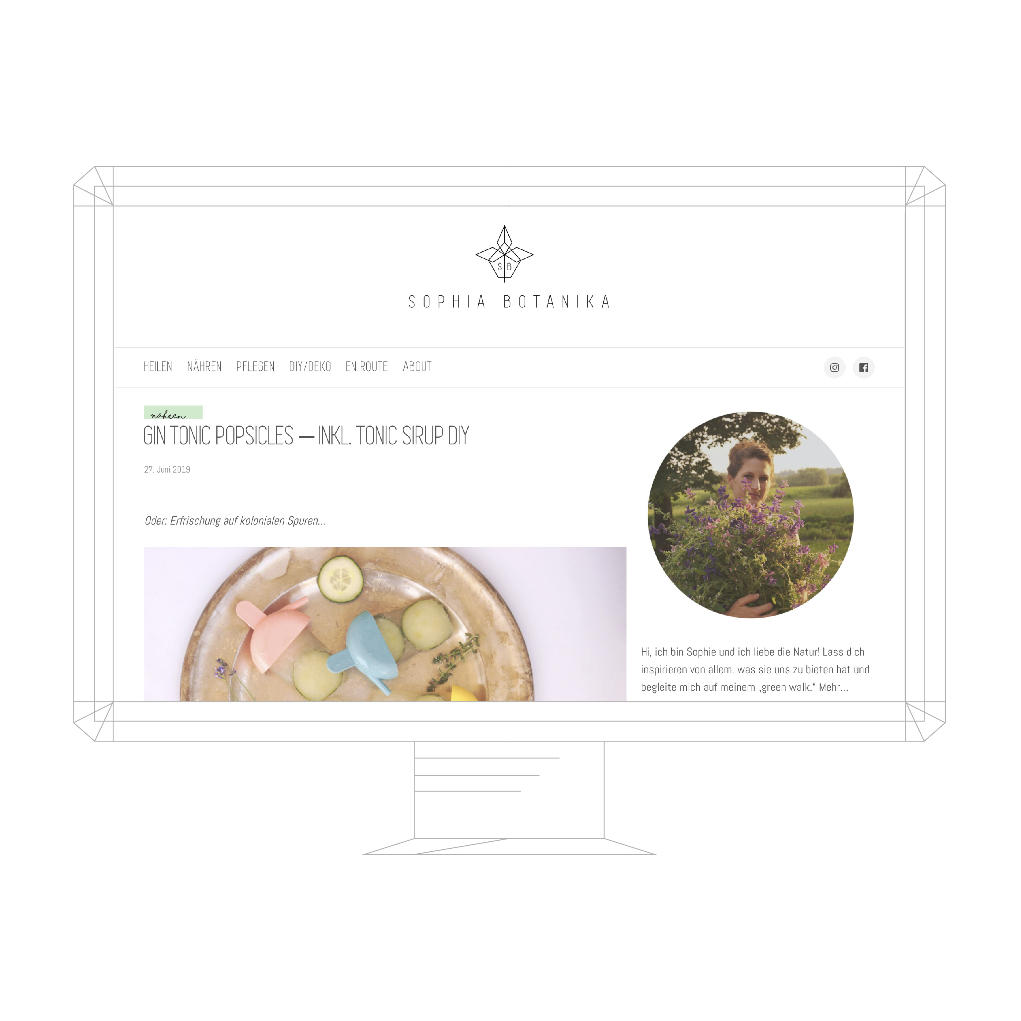
BLOG CONCEPT AND DESIGN
The blog was kept simple – divided up into several catagories, featuring large photography with ample room to breath and explain each step by step process.

